
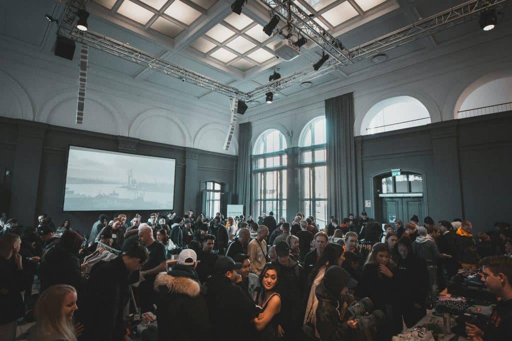
An event badge is so much more than a simple name tag; it’s a vital piece of your event’s identity. It’s a networking tool, a security pass, and a miniature billboard that every single attendee wears. In a sea of faces, a well-designed badge can make your brand stand out, communicate professionalism, and enhance the overall attendee experience. But how do you create a badge that’s both functional and a stunning reflection of your brand? It’s about blending strategic design with a clear understanding of your event’s personality.
It All Starts with Your Brand’s DNA
Before you even think about fonts or colors, take a step back and look at your brand’s core identity. What is the vibe of your event? Is it a sleek, cutting-edge tech conference, a vibrant and creative arts festival, or a formal corporate summit? Your badge design should be a direct extension of this personality. Your logo is the anchor, so give it a prominent but not overpowering position. Use your established brand color palette to create instant recognition and a cohesive visual experience that aligns with your website, social media, and event signage. Consistency is key to building a strong and memorable brand presence.
Readability is Not Negotiable
While creativity is important, the primary function of a badge is identification. If attendees have to squint to read a name, you’ve failed at the first hurdle. Hierarchy is your best friend here. The most important piece of information – the attendee’s first name – should be the largest and most legible element on the badge. Follow this with their full name, company, and any other essential details like attendee type (e.g., “Speaker,” “Sponsor,” “Media”) in progressively smaller fonts. Choose clean, clear, and professional fonts. Sans-serif fonts like Helvetica, Arial, or Open Sans are often excellent choices for their readability, even from a distance.
Beyond the Basics: Making It Pop
Once you’ve nailed the fundamentals of branding and readability, it’s time to inject some creativity. Think about the physical shape and orientation of the badge. While a standard rectangle is safe, a custom die-cut shape that echoes your logo or a key event theme can be incredibly memorable. Don’t be afraid to use bold background colors or subtle patterns drawn from your brand assets to make the badge visually interesting. Consider the material as well. Moving beyond standard cardstock to materials like bamboo, recycled plastic, or even sleek metal can elevate the perceived value and align with your brand’s ethos, whether it’s focused on sustainability or luxury.
Designing for Interaction
The modern event badge is often a bridge to the digital world. Integrating a QR code is a simple yet powerful way to enhance functionality. This code can link to an attendee’s personal schedule, a networking app, or the full event program. When incorporating these elements, ensure they are placed in a way that is easy to scan without disrupting the overall design flow. Using distinct colors or icons to differentiate between attendee types can also be a game-changer for networking, helping people to quickly and easily identify who they want to connect with.
Ultimately, designing an effective event badge is a balancing act between art and information. It requires a strategic approach that prioritizes clarity while seizing the opportunity to express your brand’s unique identity. For those looking to navigate this process with expert guidance and produce high-quality, professional badges that truly capture the essence of their event, turning to specialists like BadgeGo can make all the difference. Their expertise ensures your brand’s first physical impression is a lasting and impactful one.